
📎 Introduction
The decision to use Storybook at QIMA has been made almost from the start in mid-2019, using version 5. We are now past the two years mark since Storybook has been added to the project, and our usage has steadily increased since then.
In this first article on this topic, we'll try to explain what is Storybook, to give insights as to how we use it at QIMA, and what are our focuses for the upcoming months.
🔭 Presentation
Let's start off with a brief introduction to the tool before anything:
Quoting the documentation, “Storybook is an open-source tool for building UI components and pages in isolation”, which means that your end goal is to have a library of re-usable components which are consistents, reliables, customisables and without any outside dependency like data, API or business logic.
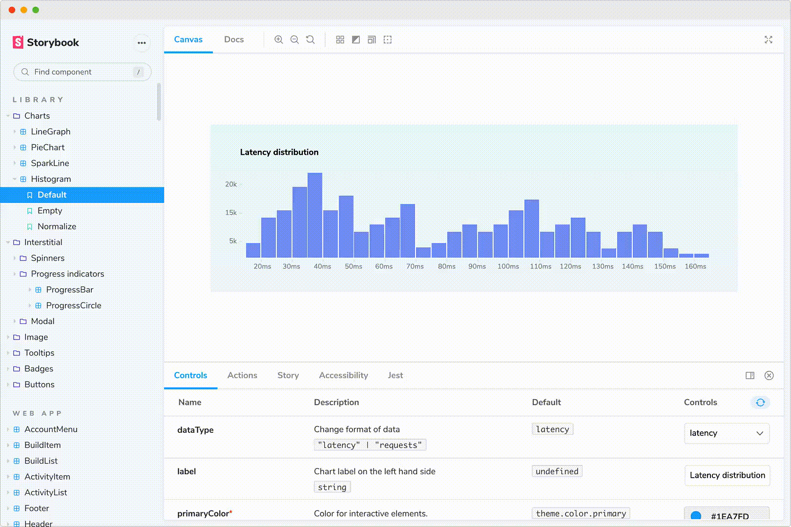
In a real-world case, most websites could have a use for a tool like Storybook. As long as your website includes any generic and repetitive elements like buttons, icons, inputs, … But you can dive even deeper by working on more business-oriented components, as long as it makes sense to create a dedicated library component for it!
😍 Benefits
Using Storybook will help your project to have :
- More consistency → No more duplicated/similar implementations for the same need.
- More genericity → Your components will be thought and implemented to cover all usages, instead of developing an element only for one specific use.
- Better documentation → This is not directly enforced by Storybook, and you could limit yourself to the automatically generated documentation, but writing a dedicated documentation for each component is a good practice that we cannot recommend enough.
- Easier onboardings → It can be difficult to understand what is at your disposal when opening up a new project. Having a storybook implemented already gives newcomers simple access to a list of easy-to-understand and easy-to-use components with easy access to visual & documentation support.
- Easier refactoring → The scope of your impacts are clear and having a regression is less likely to happen while using Storybook.
All added together, we recommand most teams to try it out, since it’s straightforward to plugin, efficient, and cherry on the cake: completely free!
🧐 Who is it for?
Since Storybook is a Front-end library, it would make sense that only front-end devs use it, right?
Well, that was our initial thoughts regarding the tool, but we quickly realized that it could also benefit from outside the dev team. The first thing we did was to include Storybook in our CI, so it has its dedicated task and deployment on an internal website; this means that anyone in our team (dev, product, QA, project manager, …) can check the current state of our library, see how every component behaves.
Moreover, Storybook naturally creates a link between your developers and UX team, and you will need both teams working together for an optimized result. Once the UX team has created the design system of your website by listing all identified generic elements, your developers have a solid base to start implementing the components.
You can also take advantage of the possibility to create an actual link from your Zeplin/zeroheight mock-ups to Storybook directly. This can be a good addition for everyone, as it helps UX team to directly view the state of the component currently in production and check if the design they are woking on will be covered by the component, or if the developers will need to make an update.
We notice the same thing for the developers, as they can quickly see if the component is up-to-date with the latest design linked to it.
🙌 Storybook-driven development
Once it’s all set up, there is a good chance you will notice the same changes we had regarding the way you start working on new features.
Indeed, instead of following a more classical Feature-driven development, we naturally switched to a Storybook-driven development, where the start of the conception is really focused on the library.
- Do we need to cover a new usage we didn’t anticipate with any existing component ?
- Is there any new identified design element that can be made in a generic way to be reusable so it can speed up future developments ?
Those two questions alone will help building a more reliable conception and overall a better project where genericity is the core value. You will end up with a constantly evolving set of components that will ease your development process in pretty much all aspects.
Moreover, the rest of the conception is also simplified since most of the UI implementation will be covered by your library, leaving you the opportunity to spend more time on the specific code for the feature you need to implement.
↗ Stay up-to-date
For most libraries, having the latest major version will ensure you a better experience, and it's the case for Storybook as well.
Version 6 of Storybook has been released on August 2020, and we finished the upgrade early March after spending some time fixing the migration issues we faced due to poor message error information and a minimalist Storybook documentation on Angular projects.
This might be something you want to keep in mind if you want to incorporate Storybook on an Angular project, since it's a React-driven project, you won't have the same functionalities and support. Nonetheless, moving to the version 6 allowed us to have quite a bit of improvements, including :
- More concise and readable code.
- Faster Storybook build time.
- Better documentation support (using Compodoc).
- Controls replaced the knobs.
- Partial .mdx support.
Outside of the direct benefits from these points, your developer team will also be more inclined to spend time and be proactive while working on a tool if the new version is more comfortable for them.
The main drawback we can mention is the breaking changes added on Storybook major versions, so it can become quite difficult to handle if you have a massive library written in an old version and you want to move to the latest one.
👁 QIMA’s short & midterms vision
The most important milestone we’re currently targetting is to add Chromatic to our Storybook stack.
Chromatic adds multiple automatic checks when working on the library, for example it will create snapshots of your component's UI, and check if any visual modification has been made. This regression check adds a new security gate before the usual testing process you are probably using.
Once we will be happy with our library state, we plan to release it publicly for everyone to see & potentially use each component we designed, implemented and documented at QIMA. It will also be a good opportunity to exchange about the good practices we tried to enforce while working on this tool, and have feedbacks from other teams using it.
📚 Conclusion
Even if we encountered some issues during the migration, Storybook is a powerful and efficient tool that definitely fulfil its promises. At QIMA we’re happy that we took the decision to start working with it, and we could not imagine removing it, which in itself is a good proof of its quality.
Hopefully thanks to this blog post, you now have a better understanding of Storybook and the vision we have about it at QIMA.
If you felt concerned by the problematics, and think that your project could/should have a Storybook implementation, we simply recommend you to Install it and try it out directly !
In a future blog post, we will focus on the technical side of Storybook and give feedbacks, detailing how we implemented it at Qima, talking about our coding guidelines we follow and also the configuration we use that works the best for us.
💟 Thank you!
If you want to be part of this adventure, we are currently hiring more Front-End developers! ✨
At QIMA, we relentlessly help our clients succeed. If you have any suggestion or remark, please share them with us. We are always keen to discuss and learn!
Written by Benoît-Charles Detuncq, Software Engineer at QIMA. ✍️